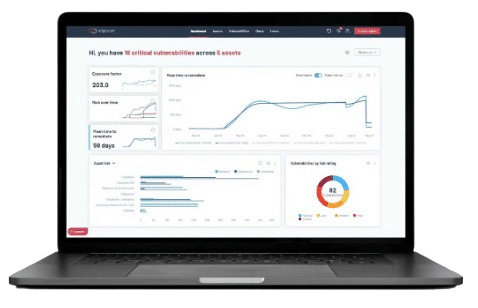

If you have been following our thought leadership series, you will know that Edgescan’s core approach to achieving optimal Vulnerability Management is to remove noise and enable security professionals to focus on what really matters. The two-pronged method for achieving this goal is to get rid of false positives (aka the noise) through a hybrid model and by offering a single touchstone of truth with a full stack VM platform. We call this the Smart VM approach. But another key element of noise decluttering and enabling actionable intelligence is in the design of the Alert Dashboard itself.
The Design Challenge – Noise Reduction Theme
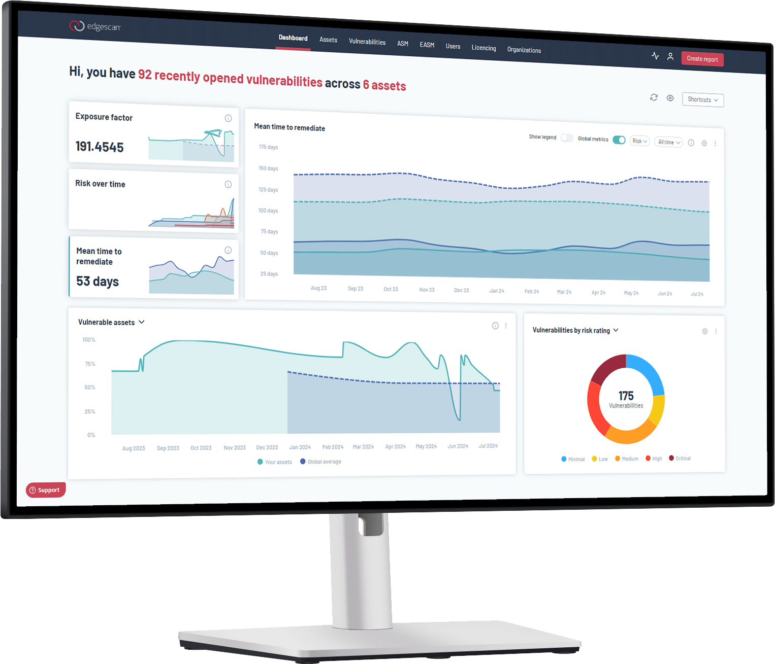
Often designers are mostly concerned about a brand theme they are trying to invoke. But in this case, the UX designers were charged with a very important functional task – enabling “noise reduction”. The UX was built with design principles around ‘noise-reduction’ by simplifying complexity and reducing clutter from the user’s experience by only exposing them to relevant information.
Design Highlights
We seized on opportunities to innovate on the user experience at every step, including:
- Focus on What Matters – a single action on the main dashboard to highlight priority issues.
- Intelligent Asset Searches – improving the filtering of assets, placing the information users need at their fingertips.
- Rapid Issue Ranking through Color Choices – The final color palette is fully color-blind accessible. Traffic light systems were used in all critical areas, so the information was understandable, even at first use.
- Personalization – The dashboard system was designed so every user would have a personalized experience based on their user profile.
Tone Balance – Friendly vs Serious
To provide a distinctive look and feel, we wanted the design aesthetic to convey an appealing, clean, and inviting interface. Yet, it also needed to convey an air of assertive professionalism, appropriate to the serious tasks the users (both our security team and our client users) perform with the software. We worked to balance these contradicting requirements, while staying true to our established brand identity. The UI is optimized based on responsive design principles and the pattern library is delivered using atomic design methodology. This gives us the flexibility to integrate and develop new features instantly. As Edgescan Product Architect, David Kennefick explains, “The comprehensive component library ensures developers aren’t in danger of spending time making decisions outside their area of expertise, bringing confidence that their work will reach a high visual standard.”
Bonus Benefit – Time Savings
The new interface not only reflects our competitive advantage; it also delivers valuable time-saving solutions for our users. As David Kennefick explains, “Support and overhead costs for onboarding and training are reduced by introducing more intuitive design, combined with more ways to authenticate. It’s much easier for our clients to train new staff on the Edgescan platform.” Validating complex security risks takes time and resources, and reducing the complexity of these tasks became the cornerstone for every design decision.
Measurable Benefits
Our customers are now able to generate reports up to 25% faster and decision-making times are reduced by up to 15%, which is proof of huge time savings for our clients. The new application design also directly reflects what makes us stand out from the competition – our unique focus on noise reduction. The new Edgescan UI has been awarded the prestigious iF Design Awards and Good Design Awards 2021. It has been described by ITSecurityguru.org (5/5 in almost all ratings) as “very well designed…making false positives a thing of the past.”
To learn more about the Edgescan Platform and see a demo of the award-winning design, click the button below:
Reducing Noise with NVM
We understand the challenges of dealing with overwhelming cybersecurity alerts. Our Network Vulnerability Management (NVM) helps you cut through the noise and focus on critical risks. From Dublin to New York, we make vulnerability management smarter and more efficient.